Friday, 28 April 2017
Wednesday, 26 April 2017
Monday, 17 April 2017

Tuesday, 11 April 2017
Friday, 7 April 2017
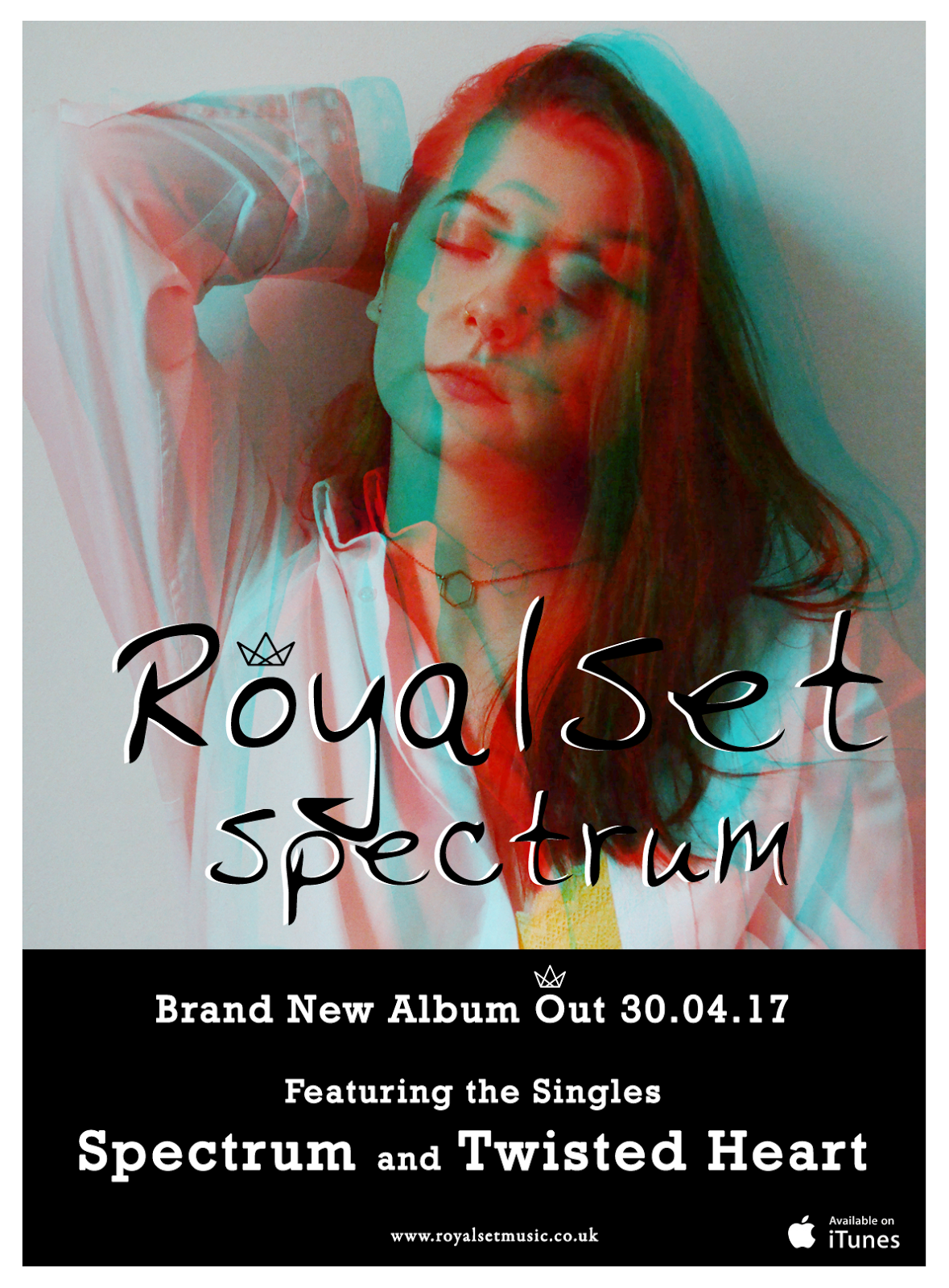
Magazine Adverts
Following on from creating our digipak, I also needed to make a magazine advert to promote the album and band. I noticed from my research that a lot of artists keep their advertising very simple, only showing the information that the audience is most interested in. They tend to use the same imagery as the album cover as this is what the consumer will recognise straight away, so I used these conventions when creating my magazine advert.
An example of some adverts (not all from my chosen genre):


An example of some adverts (not all from my chosen genre):


Tuesday, 4 April 2017
Band Symbol
I wanted to apply a feature to my band name that I knew would be recognisable to my audience and so I thought that by adding a symbol, this would be most effective.


The crown symbol compliments my band name 'RoyalSet' as it is a symbol you associate with royalty. I have placed this above the 'O' as I felt that it fit best over that particular letter.
I had noticed that other bands had featured similar things in their band names such as Bastille who use a triangle symbol in their name in place of the 'A' when promoting their band through magazine adverts, etc. They also use the same font on all their album covers which has become a prominent feature that everyone now recognises.


Monday, 3 April 2017
Digipak Quote
Towards the end of completing my digipak I noticed that the back looked rather sparse. I wanted to fill the space with something which would relate to the album’s name, and In the end found a quote which I adapted to add extra depth and meaning to the album:
“You don't get a full human life if you try to cut off one end of it; you need to agree to the entire experience, to the full spectrum of what happens. Whatever happens.”
Subscribe to:
Posts (Atom)