Friday, 28 April 2017
Wednesday, 26 April 2017
Monday, 17 April 2017

Tuesday, 11 April 2017
Friday, 7 April 2017
Magazine Adverts
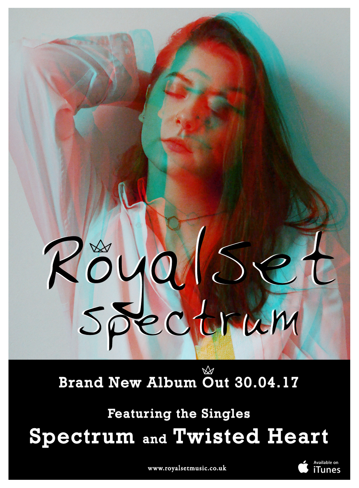
Following on from creating our digipak, I also needed to make a magazine advert to promote the album and band. I noticed from my research that a lot of artists keep their advertising very simple, only showing the information that the audience is most interested in. They tend to use the same imagery as the album cover as this is what the consumer will recognise straight away, so I used these conventions when creating my magazine advert.
An example of some adverts (not all from my chosen genre):


An example of some adverts (not all from my chosen genre):


Tuesday, 4 April 2017
Band Symbol
I wanted to apply a feature to my band name that I knew would be recognisable to my audience and so I thought that by adding a symbol, this would be most effective.


The crown symbol compliments my band name 'RoyalSet' as it is a symbol you associate with royalty. I have placed this above the 'O' as I felt that it fit best over that particular letter.
I had noticed that other bands had featured similar things in their band names such as Bastille who use a triangle symbol in their name in place of the 'A' when promoting their band through magazine adverts, etc. They also use the same font on all their album covers which has become a prominent feature that everyone now recognises.


Monday, 3 April 2017
Digipak Quote
Towards the end of completing my digipak I noticed that the back looked rather sparse. I wanted to fill the space with something which would relate to the album’s name, and In the end found a quote which I adapted to add extra depth and meaning to the album:
“You don't get a full human life if you try to cut off one end of it; you need to agree to the entire experience, to the full spectrum of what happens. Whatever happens.”
Thursday, 30 March 2017
Digipak & Poster Font
Throughout my research on what font I wanted to use on my digipak, I had decided that I would like to go for a more handwritten look as this fits better with my chosen genre, however, I now believe that a bolder font may be best as it would be a lot clearer for the consumer to read.


I decided that the font below is the font I would like to use on both my digipak and my magazine advert. Here is an example of how it may look:

Wednesday, 29 March 2017
Digipak Draft
Here's a WIP of my digipak. I still need to add several elements such as the barcode, the explicit content label and a design for the CD, but I am happy with how it is looking so far.
While researching other digipak's in my chosen genre, I found that they stuck to the same colours, and so I complied to this when making my own digipak. I obtained inspiration from bands such as the Arctic Monkeys and The 1975 as I liked the simplicity that their album covers held.

Tuesday, 28 March 2017
Digipak Template
I downloaded a free digipak template from a website named 'Disc Markers'. The template gives me a guideline of how to lay out my photos for my digipak (including the sizing) and where I need to place each individual photo.

So far this is what I have put together:

For the moment I have only chosen the style of my front cover and the font I am using, but I am still planning and researching what I can use on the other sections of my digipak. I would like to go with a fairly simplistic design as I feel that it goes with my chosen genre, and will still attract my audience, especially as I have decided to go with fairly bright colours. I do not want my digipak to be too busy as this would distract the audience from the artist on the front cover.
Monday, 27 March 2017
Friday, 24 March 2017
Digipak Inspiration
The Arctic Monkeys & The 1975 were large inspirations of mine when it came to creating my digipak due to the simplicity of their album covers. They do not give much away as to what the band are like as they have no images of themselves, but this almost intrigues the audience as to what kind of music they produce.


I was interested in using dark colours but to make mine stand out and link it in some ways to my album name, I decided that I wanted to use some colour. To add onto that, although I have planned my album cover to be very simple, I would also like to include an image of my artist on the front cover. Along with the colours, I feel like the word 'Spectrum' would go well with multiple images of my artist.

Monday, 20 March 2017
Bands & Their Chosen Names
While researching my chosen genre during the creation of my digipak, I became intrigued into the reason why some artists/bands chose their stage names. Here are a few examples:

Lorde (also known as Ella Marija Lani Yelich-O'Connor) chose her artist name due to being fascinated with "royals and aristocracy". However, she felt that the word 'Lord' was too masculine and so added an 'e' to the end to make it more feminine.

Birdy's stage name (also known as Jasmine Lucilla Elizabeth Jennifer van den Bogaerde) comes from the nickname her parents gave her as a baby, because she opened her mouth like a little bird when being fed.

Foster The People: Mark Foster originally named the band Foster & the People, but people misheard it as "Foster the People". Eventually, he took to the nurturing image it evoked of "taking care" of people, so the name stuck.
Wednesday, 15 March 2017
Goffman's Theory (1972) - Gender Representations in Advertising
In the portrayal of men and women, advertising often uses the following codes and conventions:
- Superiority, Domination & Body Language: Men are shown in dominant positions and appear to be reflective of thought and intelligence. Women are physically portrayed in sexual or reclining poses with blank or inviting expressions.
- Dismemberment: On females, parts of the body such as legs, chest, etc., are used, rather than the full body. This is often applied to sell products which are not related to the body, such as mobile phones (right)
- The Voice-Over Authority: In moving image advertisements, male voices are used as voice-overs in commercials rather than females.
Sunday, 5 March 2017
Evaluation Questions
In the evaluation the following four questions must be addressed:
- In what ways does your media product use, develop or challenge forms and conventions of real media products?
- How effective is the combination of your main product and ancillary texts?
- What have you learned from your audience feedback?
- How did you use media technologies in the construction and research, planning and evaluation stages?
Saturday, 4 March 2017
Lorde - Green Light
I found the music video for Lorde's new song 'Green Light' very interesting as the main focus was on her performance, not on the narrative. The shots are relatively long but this works well as she is mainly singing. I particularly liked the changes of scenes/environment and the different colours that are used.
Saturday, 18 February 2017
Digipak Front Cover Experiment
Following the general conventions of an indie pop album cover, I decided to experiment with some of the fonts I had downloaded with an edited picture of Klaudia. I would like to go with the handwritten look as I feel it fits my genre best. I would also prefer the background to be white as I feel that would make Klaudia stand out much more and it would also fit with the colour of the band name and album name. I'd like to experiment with the placement of the band name and album name, but I will probably take more pictures of Klaudia before doing so.
Also, I am unsure if this is the band name I would like to use but as it was an experiment, I had just decided to use one that I had come up with earlier.

Subscribe to:
Posts (Atom)